Color Filters vs Contrast Themes in Windows 11 Accessibility

Color filters and contrast themes are two built-in Windows 11 accessibility tools that change how colors appear on your screen. Both are meant to help you read text and spot details more easily. They work in different ways, so it helps to know which one fits your problem.
Color filters adjust the entire color palette across your whole display. They are aimed at red-green, green-red, or blue-yellow color blindness. Contrast themes replace the standard Windows color scheme with high-contrast text on solid background boxes.
Both live in the Accessibility section of the Settings app. You can switch either one on and off in seconds, so try each and see which one stops your eyes from getting tired during long sessions. Neither needs a restart, and both are available in Windows 11 Home and Pro.
Color filters adjust the entire color palette to help with color blindness and eye strain, while contrast themes replace the Windows color scheme with high-contrast text on solid backgrounds. Both live in Settings Accessibility and apply system-wide without requiring a restart. Choose color filters for color blindness or bright-screen fatigue; use contrast themes if you need darker text against lighter backgrounds for readability.
Understanding Vision Accessibility on 🪟 Windows 11
Vision accessibility in Windows 11 is a set of built-in tools for people with low vision, color blindness, light sensitivity, or general eye strain. The default screen settings often use bright white backgrounds and fairly low contrast. Over a full workday, that can cause headaches and tired eyes.
Windows lets you change display colors and text contrast to match what you actually need. You do not have to buy extra hardware or install third-party software. Everything below is already in Settings.
What Are 🪟 Windows 11 Color Filters?
A color filter works like a tinted lens over your monitor. It changes the color palette for the entire display, so it affects web browsers, games, photos, videos, and system menus alike. It is not a per-app setting.
The main use is for people with color blindness. The filter shifts colors so that shades that look alike become easier to tell apart.
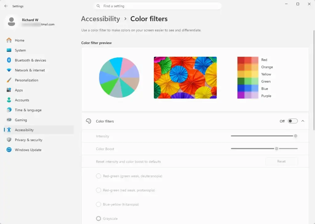
The red-green and blue-yellow filters are designed to separate colors that normally look similar to someone with color blindness, such as red and green. There is also an inverted filter that flips all the colors on your screen. Many people use it to cut glare in dark rooms.
That is expected. If you need accurate color for design or photo work, turn the filter off while you do that work.
Who Benefits Most From Color Filters?
Color filters help people who have trouble telling red and green apart, or blue and yellow. The filter adjusts specific parts of the color spectrum so those pairs are easier to separate.
They also help people who get severe eye strain from bright white screens. The inverted filter turns bright white backgrounds into dark ones across the whole operating system. In effect it gives you a dark mode, even in apps and websites that have no dark mode of their own.
Images and video will look like negatives, so inversion suits text-heavy work best.
How to Turn On and Customize Color Filters in 🪟 Windows 11
Turning on a color filter takes a few clicks in Settings. You can test several filters quickly until one works for your eyes. The change applies at once, with no restart.
- Click the Start button and select Settings. You can also press the Windows logo key + I. The Settings window opens.
- Click Accessibility in the left-hand menu. The accessibility options appear on the right.
- Scroll down to the Vision section and click Color filters.
- Click the toggle next to Color filters to switch it from Off to On. A list of filter types appears.
- Choose the filter that suits your vision: Red-green (green blind, deuteranopia), Red-green (red blind, protanopia), Blue-yellow (tritanopia), or Inverted. The exact wording of these labels can differ slightly between Windows 11 builds. The screen colors change as soon as you pick one.
- If the page shows an intensity slider for your chosen filter, move it until the colors look right to you.
To undo the change, return to Settings Accessibility Color filters and set the toggle back to Off. If you will switch filters often, look for the keyboard shortcut toggle on the same page. It lets you turn the filter on and off from the keyboard.
What Are 🪟 Windows 11 Contrast Themes?
A contrast theme replaces the visual design of Windows and your apps with a few strongly contrasting colors. Unlike a normal dark mode, it uses bright text on solid backgrounds. Every button, menu item, line of text, and image border stands out.
It also enforces a strict rule: background elements must not blend into text or icons. That produces clear boundaries between screen elements, which makes navigation much easier for people with low vision or severe light sensitivity.
Who Benefits Most From Contrast Themes?
Contrast themes help people with low vision, other visual impairments, or severe light sensitivity who struggle with the standard Windows interface. The sharp separation shows you where a button ends and the background begins.
They are also useful in very bright places, such as a sunlit room or an office with harsh overhead lights, where a standard screen washes out and becomes hard to read.
How to Turn On and Choose a Contrast Theme in 🪟 Windows 11
To choose a contrast theme, open Settings, go to Accessibility, and pick one from the drop-down list. Windows 11 ships with several ready-made themes.
- Click the Start button and select Settings. You can also press the Windows logo key + I.
- Click Accessibility in the left-hand menu.
- Scroll down to the Vision section and click Contrast themes.
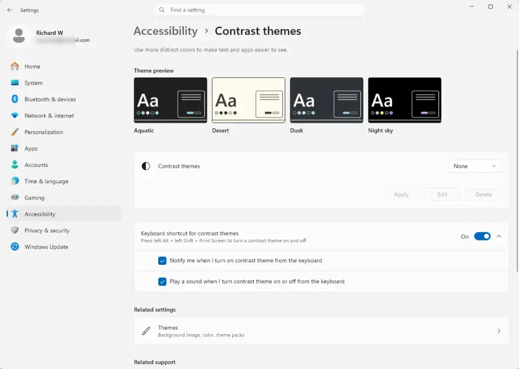
- Open the drop-down menu labeled Contrast themes and select one of the built-in options: Aquatic, Desert, Dusk, or Night sky.
- Click the Apply button. The screen may go blank for a moment with a "Please wait" message. Then your new theme appears across the system.
If you do not like the result, pick a different theme and click Apply again. To go back to normal colors, choose None from the same drop-down and click Apply. After you pick a theme, an Edit button lets you change individual colors in it.
Color Filters vs Contrast Themes: Key Differences
The main difference is how each tool changes your display. A color filter lays a color layer over the entire screen and modifies the hues that are already there. A contrast theme replaces the color scheme of your system menus and compatible apps with distinct, sharp boundaries for better readability.
- Scope of Changes: Color filters modify the existing hues of everything on screen, including photos, videos, and apps. Contrast themes replace the color scheme of system menus and compatible apps with a high-contrast palette, which changes how text and buttons are drawn.
- Primary Purpose: Color filters help users with color blindness tell hues apart, or invert screen colors to reduce brightness. Contrast themes help users with low vision separate text, borders, and interactive buttons from their backgrounds.
- Customization: Color filters let you choose a specific type of color blindness and adjust a slider for color intensity. Contrast themes let you edit the individual colors in a theme, so you can set the color of text, hyperlinks, selected items, and backgrounds the way you want.
As a rule of thumb: if the problem is telling colors apart, start with a color filter. If the problem is seeing where text and controls begin and end, start with a contrast theme.
Unique Strategies: Combining Accessibility Tools for Maximum Comfort
You can layer accessibility tools for more comfort. Some people pair a contrast theme with the Magnifier to reduce harsh brightness when a single setting is not enough.
For example, if a standard contrast theme feels too harsh or bright, you can use Magnifier to invert colors in the magnified area instead of changing the whole operating system. You keep your normal desktop colors while zooming in on, and darkening, the document or webpage you are reading.
Another approach is to pair a custom contrast theme with Night light. The contrast theme handles the sharpness of text and boundaries, while Night light reduces the blue light your screen gives off in the evening. Used together, they can keep your eyes more comfortable late in the day.
Change one setting at a time when you experiment. That way you can tell which one is helping, and you can undo just that one if it does not.
Summary
Windows 11 accessibility features reduce eye strain, help with color blindness, and make the display easier to read. Color filters act like tinted lenses over your entire screen so colors are easier to tell apart. Contrast themes change the system color palette to put sharp boundaries around text and buttons.
Try each one for a few days of normal work. Both are easy to switch off, so you lose nothing by testing.
Have a question about this guide?
Answered by AI from this guide. Good questions may be added to this page — please don't include personal details.
Did this guide fix your problem?

About the Author
Richard
Tech Writer, IT Professional
Richard is a writer at Geek Rewind who turns complex IT tasks into clear, step-by-step guides. He draws on years of hands-on experience in system administration and enterprise IT operations, focusing on Windows, Linux and WordPress: the problems people actually run into, and the fixes that work. His server and WordPress guides come from systems he runs himself. Richard builds and maintains the platform behind Geek Rewind, from its Ubuntu servers and Nginx configuration to its custom WordPress plugins. Many new tutorials start with readers' questions, and he's always glad to answer them in the comments.
No comments yet — be the first to share your thoughts!